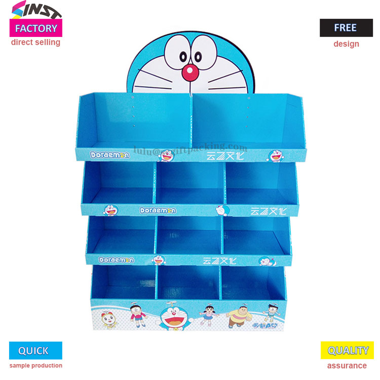
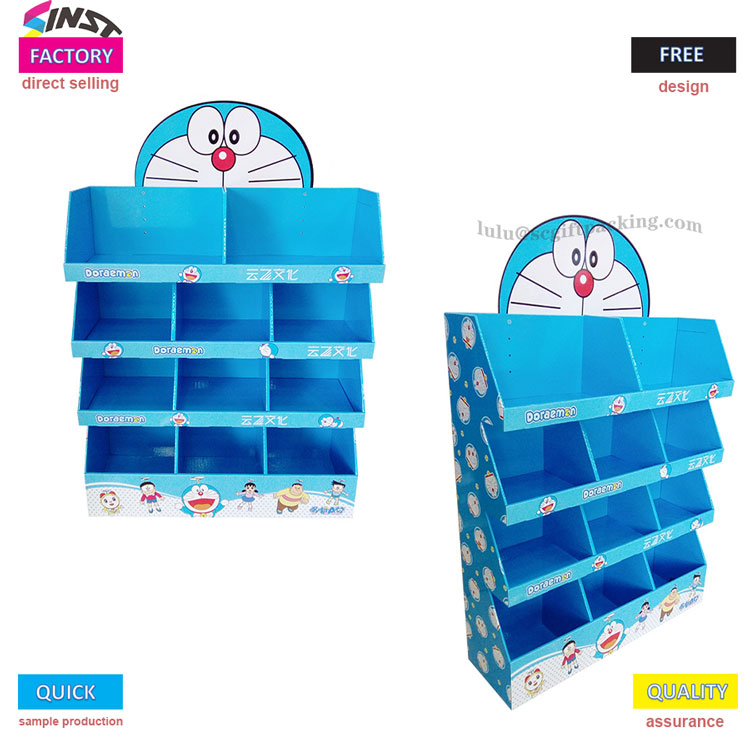
The cookie display rack, with its blue color scheme, top cartoon avatar, and multi-layered classification structure, has become a "eye-catching new force" in the snack area. From the design drawings, Biscuit display rack can be seen that the main body adopts a refreshing blue and white color scheme, with a cartoon shape of a round head and a round brain at the top. The silly posture of holding a copper gong and burning it perfectly blends with the blue body. The absence of cookies already comes with a "traffic attribute", which is called a "display artifact that can attract customers on its own" by the shop owner.
The overall structure consists of four layers of partitions, with each layer divided into six small compartments that can be used to classify and place different types of cookies such as cookies, sandwich cookies, and wafer cookies. The small compartments are deeply fitted to the size of the bottle/box, which is both anti tipping and easy to access. Against a white background, the blue subject and cartoon elements are more vivid, making the Biscuit display rack "jump out" from the supermarket shelves, even adults can't help but stop and take photos.
This is a way to activate sales with 'fun'. Classic cartoon patterns naturally possess the dual attributes of "attracting children and awakening parents' memories". On site testing shows that customers stay 40% longer in cookie display racks with cartoon patterns than in regular display areas, and the probability of children actively requesting to purchase increases by 50%. From community convenience stores to supermarkets in Nakajima, this cookie display stand that combines cuteness and practicality is redefining "snack display" with anime language - originally selling cookies, it can also be sold as a "childhood memory killer".

 English
  Español
  Português
  русский
  Français
  日本語
日本語  Deutsch
  tiếng Việt
  Italiano
  Nederlands
  ภาษาไทย
  Polski
  한국어
한국어  Svenska
  magyar
  Malay
Malay  বাংলা ভাষার
  Dansk
Dansk  Suomi
Suomi  हिन्दी
  Pilipino
  Türkçe
  Gaeilge
  العربية
  Indonesia
  Norsk
Norsk  تمل
تمل  český
český  ελληνικά
  український
  Javanese
  فارسی
فارسی  தமிழ்
தமிழ்  తెలుగు
  नेपाली
  Burmese
  български
  ລາວ
ລາວ  Latine
  Қазақша
  Euskal
  Azərbaycan
  Slovenský jazyk
  Македонски
  Lietuvos
  Eesti Keel
  Română
  Slovenski
  मराठी
मराठी  Srpski језик